
GYUBEE
Designing a dining experience that reclaims wait time
Role: UX Research, UI Design, Visual Design, Design System
Timeline: 2 weeks
Platform: Customer facing POS
Read Time: 10 mins

From Server to Problem-Solver
This was the first project I ever worked on.
For three years, I worked as a server at Gyubee, a popular Japanese BBQ restaurant. Over time, I started noticing a pattern — a disproportionate number of negative reviews focused on long wait times and the lack of a reservation system.
The more I worked, the clearer the problem became. Customers were frustrated waiting for a table, grumpy, even before the waiters get to greet them. Staff were overwhelmed trying to manage the influx during peak hours. And the restaurant had no streamlined system to handle it all.
I made a costume as the restaraunt’s popular dessert “Crème Brûlée” for Halloween.
The First Attempt: an obvious solution to an obvious problem
I started designing an app that could:
Let customers make reservations
Join a waitlist and receive updates
Order food from their phones
Get notified of promotions
And even save meal preferences for next time
The initial designs looked promising. With proper user research, I mapped out flows, mocked up the UI, and started thinking about implementation.
But eventually, I hit a wall.
Despite the UX being solid, I realized something critical:
Reservations and waitlists don’t guarantee faster service — they only shift expectations. And if Yelp’s waitlist and Google’s reservation service can’t guarantee no wait time, how can I?

Hitting Reset: Going Back to the Problem and Finding a New Solution
I took a step back and relaunched the project. Downscoping the project from a Point of Sales (POS) system to an MVP that focuses on the customer’s side of the dining experience.
This time, I grounded it in whitepaper research and user interviews, especially from industry papers and other high-traffic restaurants facing similar operational challenges.

Competitive Analysis
POS ordering systems aren’t targeting AYCE restaurants
Square
Limited customization
Toast
No customer facing UI, requires hardware
Shopify
Not ideal for restaurants, no kitchen display system, weak order management
Snappy
Offers solution for AYCE restaurants, but bad UI
Whitepaper Research
Findings that later inspired my designs:
Time feels distorted during idle state
Filling wait time with distractions reduce perceived wait time
Systems that empower customers (e.g. apps, text notifications) help restore control and minimize perceived waiting discomfort
Flexible rules with allocating seats will boost revenue by
7.5%
Reducing wait time will boost revenue by
15%
User Research
Interviews, research, 180+ data points, and 8 main themes.
During the initial project phase (2023) and the relaunch in 2025. I’ve conducted a total of 6 user interviews with customers, 3 with servers, and 1 with the owner. I’ve researched online reviews of the restaurant extensively on multiple platforms. Gathering 180+ data points which I narrowed down to 8 main themes.
For customers:
Long wait time (70%)
Lacks reservation & waitlist system causes wait time for up to 3 hrs
Poor service (20%)
Order mess ups caused by staff and customer
Strict time limit
Poor food quality (10%)
Inexperienced with cooking results in poor food quality
For Servers:
Overwhelmed during rush hours
All tables come in at once, leaving other tables unattendedPoor service (20%)
Low turnover rate
Delays result in customers to stay longer than the 2 hrs limit
Inadequate ordering system
Ordering UI cause order mistakes and printing bills
For Owners:
Difficulty making informed business decisions
Doesn’t have a way to accurately track sales per customer
Negative reviews
Undesired amount of negative google reviews that bring down the rating

Starting Design With The Million Dollar Question:
How might we reduce customer frustration during unavoidable wait times?
The conventional approach to solving long waits is to improve the reservation and waitlist system — and that’s the road I initially went down. I designed flows that let users reserve a table, join a waitlist, and receive SMS updates.
But partway through, I had to be honest with myself: Can I realistically design a reservation system that’s better than what Yelp or Google already offer — with their user base, integration, and infrastructure? The answer was no. And that realization became the turning point of this project. If I couldn’t eliminate the wait, then maybe I could reframe it.
The solution, inspired by my white paper research, ended up solving 6 pain points at once:
What if I could make the wait... feel shorter?

Finding problems in the current workflow
I mapped out the current workflow and realized…
Customers wait up to 3 hours with nothing to do and no guarantee that their tables will be ready.
In order to control potential waste, the restaurant doesn’t allow customers to make their own orders.
AYCE customers have the behavioral pattern of ordering large amount of food on the first round, followed by a few selections of favorite items in future rounds.
This means: Server’s are tied down to one table to take a large order, collect payment information, allergy information, and answering any questions regarding the menu. While other unattended tables can have grills that are on fire and babies puking on their boosters. Not a fun sight to see.
The New Approach
Letting customers drive the dining experience
Inspired by techniques discovered during my white paper research. I realized giving the customers something to do during their wait will boost satisfaction. With this new workflow:
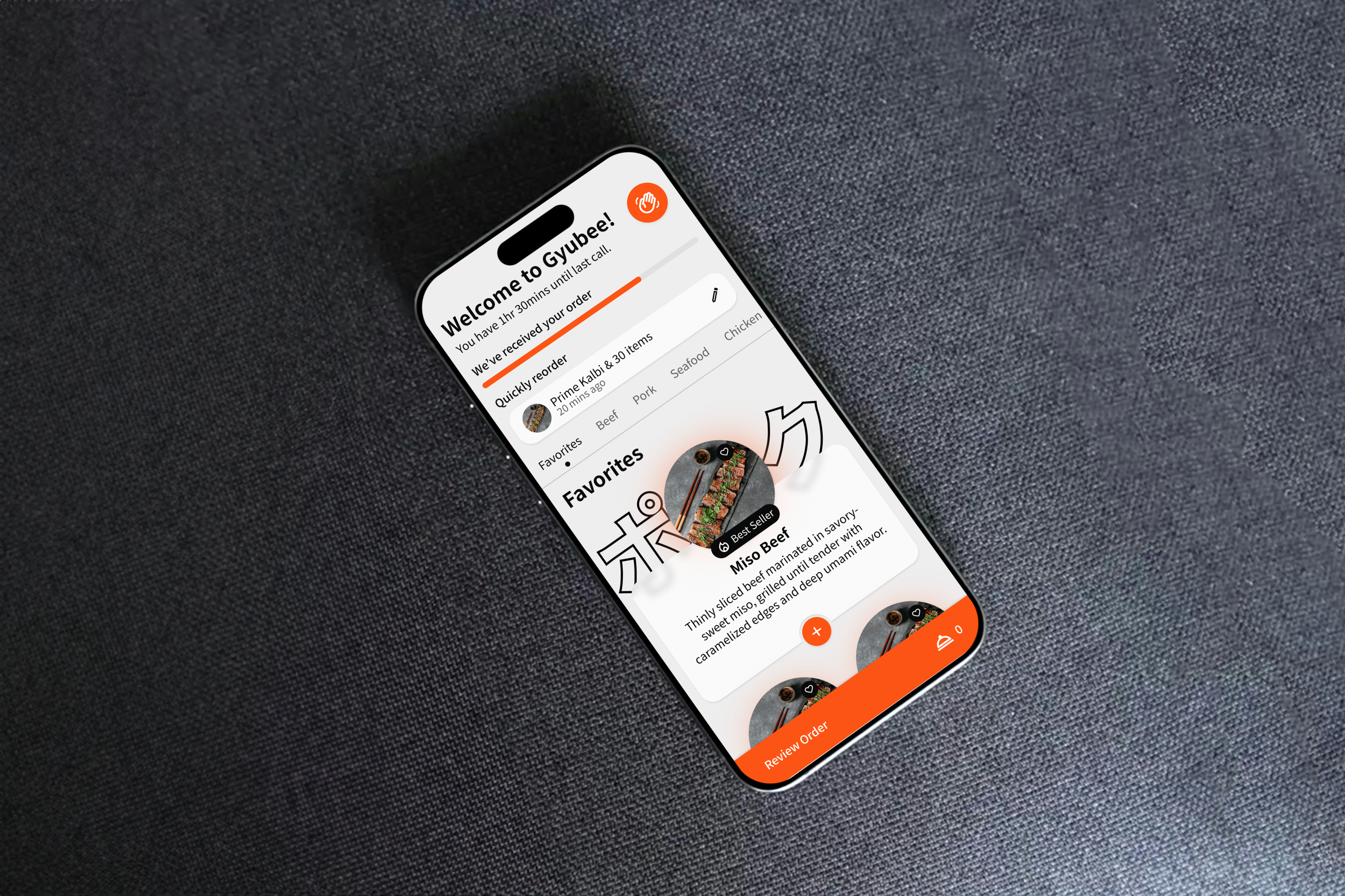
Customers can browse the menu and pre-order the first round of order while waiting for their table.
Customers feel impowered, confident that their table will be ready soon, and know their food will be ready as soon as they sit down.
Servers are no longer tied down to a table with mandatory tasks like going through dining rules, allergy information, introducing the menu, etc. Instead, all of these information will be collected automatically.
Servers are empowered to tend multiple tables at once, while still having the control over each order that’s sent out by the customers to avoid potential waste.
Designing the solution that crosses off 6 pain points at once
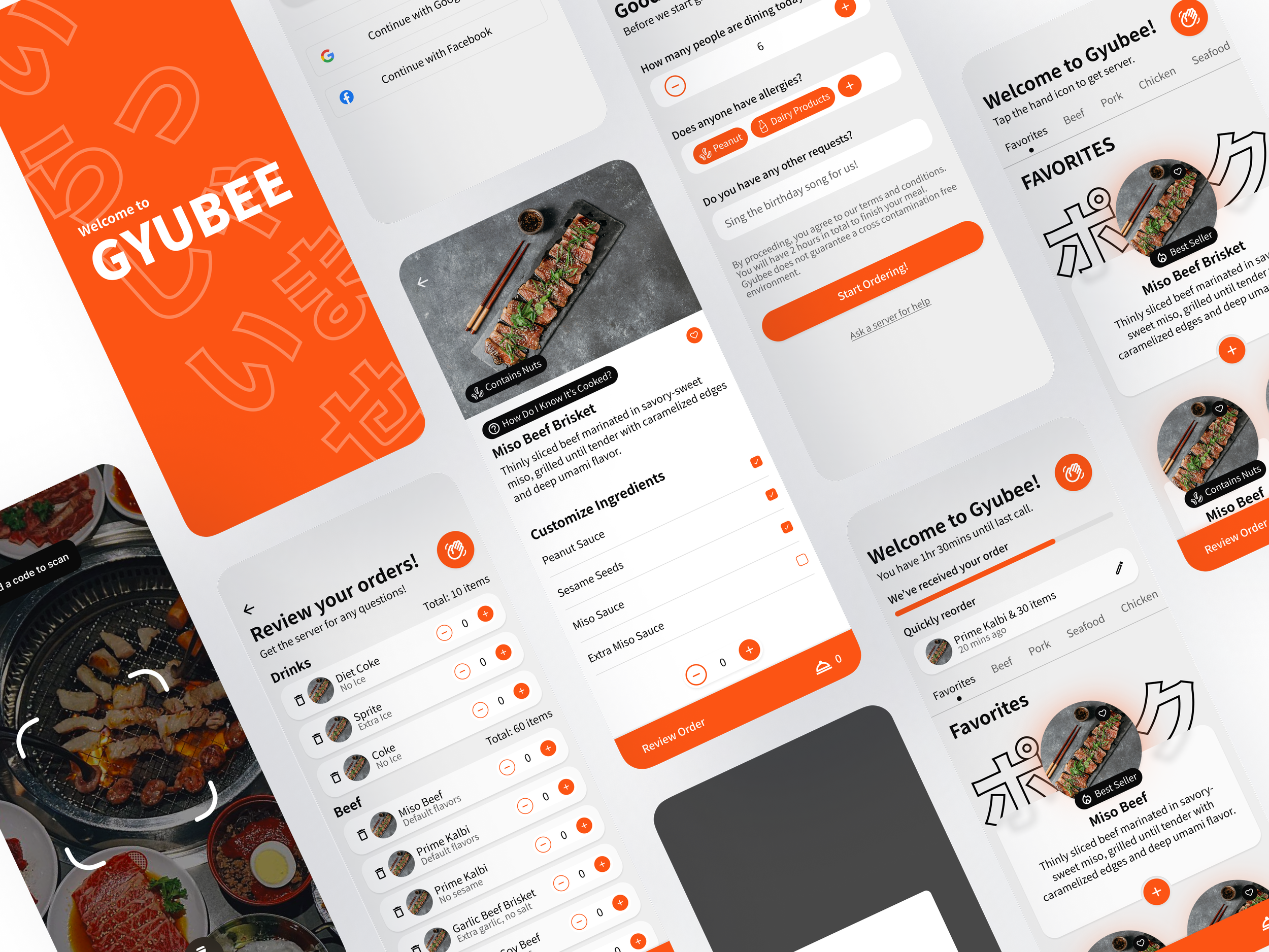
I created multiple iterations of wireframes and prototypes. Each iteration is tested and improved upon the next. I’ll showcase a brief overview of the work space, you’ll have access to the full Figma file.
Wireframes
Major changes throughout iterations
01 Switching from mobile app to web app
Originally, the experience was designed as a native mobile app. But after usability testing and research, I found that a web app was a better fit for the restaurant context.
4/5 test participants expressed hesitation about downloading an app for a one-time meal.
QR-based onboarding (via table signage or confirmation email) felt more natural and expected.
02 Removing Bottom Navigation
In early wireframes, I used standard bottom navigation with 3–5 icons (Home, Menu, Orders, Profile, etc.). However, this pattern created unnecessary complexity for a task-oriented experience like food preordering.
3 out of 5 users expected a linear flow, not a tabbed system — they wanted to be “guided” step-by-step.
The experience wasn’t app-like enough to justify persistent tabs.
03 Further Enabling Customers
Quick Reorder
After trying out the menu, users start to repeatedly order their favorite items.-
“I always order the same stuff. I just want to repeat what I had last time.”
Result: Repeat order shortcut tested well — especially for lunch crowds and repeat diners.
Order Status
Users wanted clarity after submitting their pre-order:
“How do I know if they got it?”
“Is it being cooked now, or when I sit down?”
Result: Added clear order state indicators (e.g., “Received,” “Pending,” “Cooking after seating”).
Favorites & Preferences
Users wanted a way to save specific items they liked:
“It would be cool if I could just tap my faves instead of searching.”
Result: Added simple “heart” icon + favorite list accessible at ordering step.
Simplifying the Item Detail View
4 out of 5 users didn’t swipe the carousel at all:
Users skimmed the screen looking for 1–2 key things:
Cooking instructions
Allergy/sauce ingredients
The visual layout had too much hierarchy competition — buttons, images, swiping indicators, icons, and text all felt equal in weight.
04 Giving servers context before tending table
In fast-paced, high-turnover restaurants like Gyubee, servers often walk into a new table with no context. They spend the first few minutes asking:
“How many of you?”
“Any allergies?”
“Have you been here before?”
“Do you need help with the menu?”
This slows down service, frustrates both staff and diners, and can lead to mistakes during the initial rush.
The app collects essential info before and during the customer’s dining experience:
Party size
Allergies or dietary restrictions
Any special notes (e.g., birthday, extra napkins, language support)
What do you need the server for
These features reframe the app as a two-sided tool — not just for diners, but also for the restaurant team. By giving servers information before they arrive at the table, we empower them to work smarter, move faster, and provide better service.

The final prototype and link to design file

Systematic design thinking
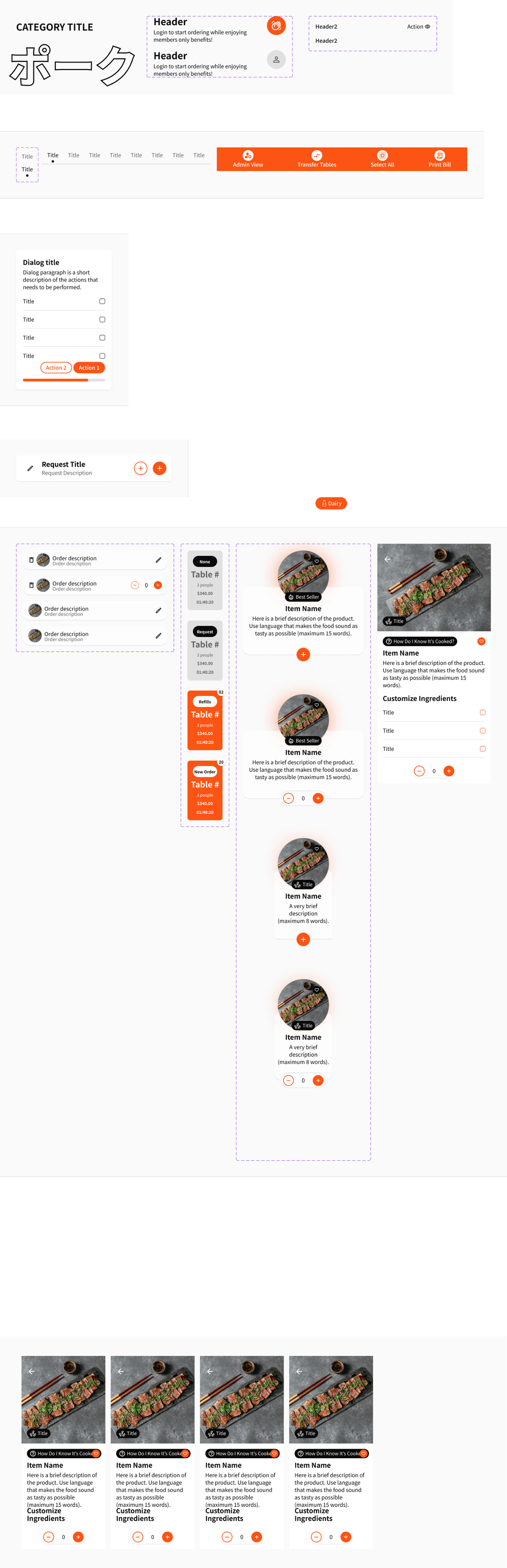
A scalable design system to support growth and consistency
While building the Gyubee experience, I quickly realized this wasn't just a one-off flow. Even as an MVP, the product touched multiple contexts: customers pre-ordering at home, staff preparing orders at the restaurant, and servers referencing allergy information in real-time.
To support all of this — and to ensure consistency across flows, devices, and user types — I built a scalable, atomic design system.

Takeaway
Working on this project taught me that innovation doesn’t always mean reinventing the entire system — sometimes it’s about reframing the problem.
Originally, I set out to solve wait time by designing a better reservation system. But through deeper research and lived experience as a server, I realized the more impactful opportunity wasn’t about avoiding the wait — it was about redefining how customers experience it.
Other key lessons included:
The power of whitepaper research in identifying overlooked patterns in restaurant workflows
The value of co-creating with frontline staff, who often hold the most practical insights
The importance of a scalable design system that supports consistency across evolving features
Next Steps
This MVP is just the beginning. Future phases of the product could include:
Loyalty & personalization features
Smart recommendations and faster reordering based on previous visitsStaff-side tools
A server dashboard to monitor table readiness, prioritize handoffs, and optimize flowAnalytics for business owners
Insights into peak hours, dietary trends, order patterns, and staff efficiency