
ZYO
Designing a project management app that seamlessly fits into existing workflows
Role: UX Research, UI Design, Visual Design
Timeline: 4 days
Platform: Web Application
Read Time: 3 mins
Keeping this one short & sweet. Have time for the full case study?
THE PROBLEMCurrent Apps on the market has unintuitive workflow, lacks collaboration features, and has a steep learning curve.
After a full day of user research, these are common themes creating gaps on the market that ZYO can target and stand out from the competition. Due to the time constraint, I chose to prioritize solving unintuitive workflows. While developing all other basic features.
Here are the common themes, more on this in the full case study.
-
Forgetting to start or stop timers is a common pain point, having to correct time logs later is a frustrating and time-consuming process.
-
It’s hard to share updates with collaborators without exposing sensitive information or spending too much time on manual reporting.
-
Many existing solutions are packed with unnecessary features, making them confusing and intimidating for beginners.

After user research and analysis, it all comes down to one question:
How might we prevent the user from forgetting to track their billable hours?
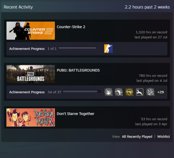
THE INSPIRATION Automated time tracking function inspired by Steam
Midway through my design process, I realized I was approaching the problem like any typical project management app—building a time tracker that relied on the user to manually start and stop it. But that manual aspect was exactly what I wanted to eliminate.
The breakthrough came unexpectedly during a gaming session with friends. I noticed that Steam automatically tracks how many hours a player has spent in a game. It starts timing when the game launches and stops when it’s closed.
That insight sparked an idea: What if ZYO could do the same for creative work? Instead of asking users to start a timer, ZYO could detect when work begins—like opening design software or switching into "focus mode"—and track hours automatically. This small shift could solve a major pain point: forgetting to track billable time.
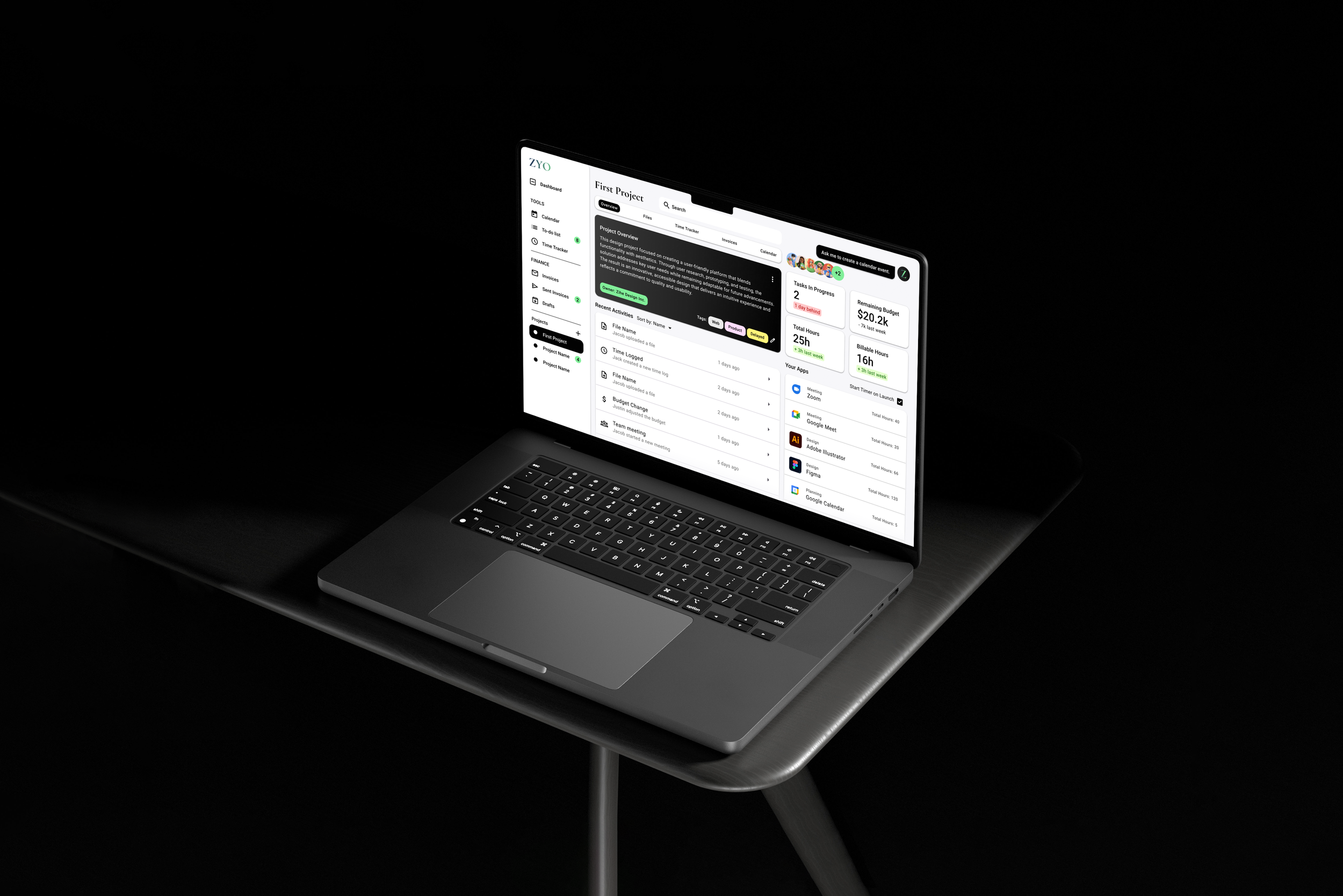
THE SOLUTION01 AUTOMATED TIME TRACKER
The Time Tracker page offers the Timer tool and an overview of the user’s billable hours. The timer tool is automated with smart suggestions to fill in gaps or adjust logs.
After the timer is activated, a floating window hovers on the desktop to remind users to log their session. Using a tags system removes need to assign each time record to specific projects, offering freedom and flexibility for different users.


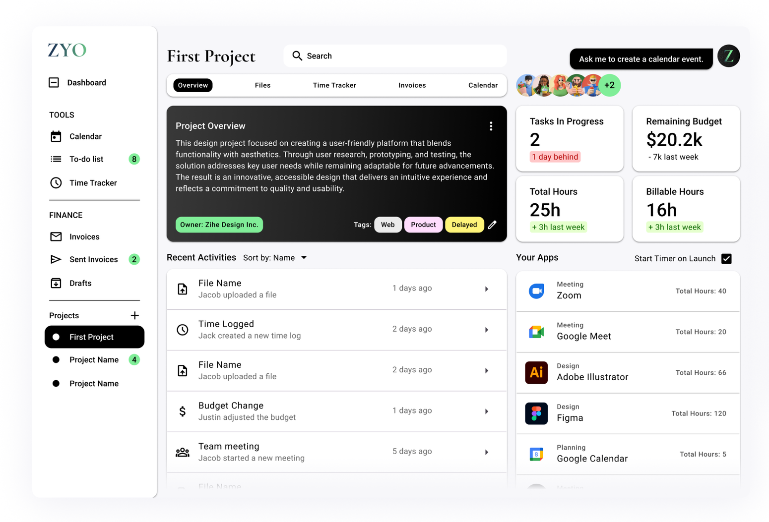
FEATURE 202 PROJECT OVERVIEW
The project overview includes an App Launchpad aimed to support the automated time tracker function. When the user launches a tool from this page, the timer automatically starts logging billable hours.
The Project Overview page updates you on recent activities and changes made by your team. This ensures effective communication between members by keeping everyone up to date.
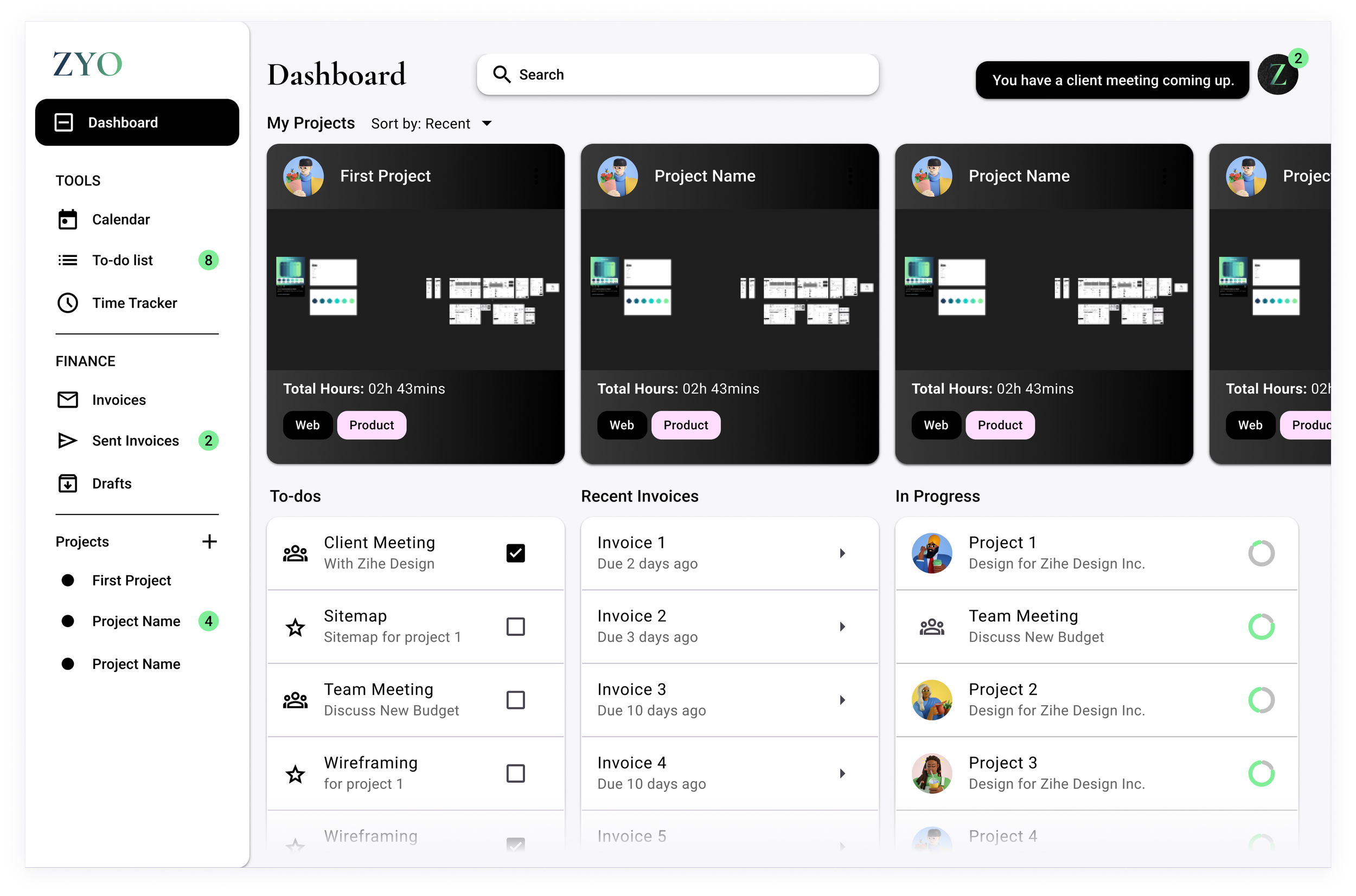
FEATURE 303 DASHBOARD
The Dashboard gives a quick overview of all current active projects. From here the user can choose to navigate to recent projects, pick up tasks in progress, or act on overdue invoices.
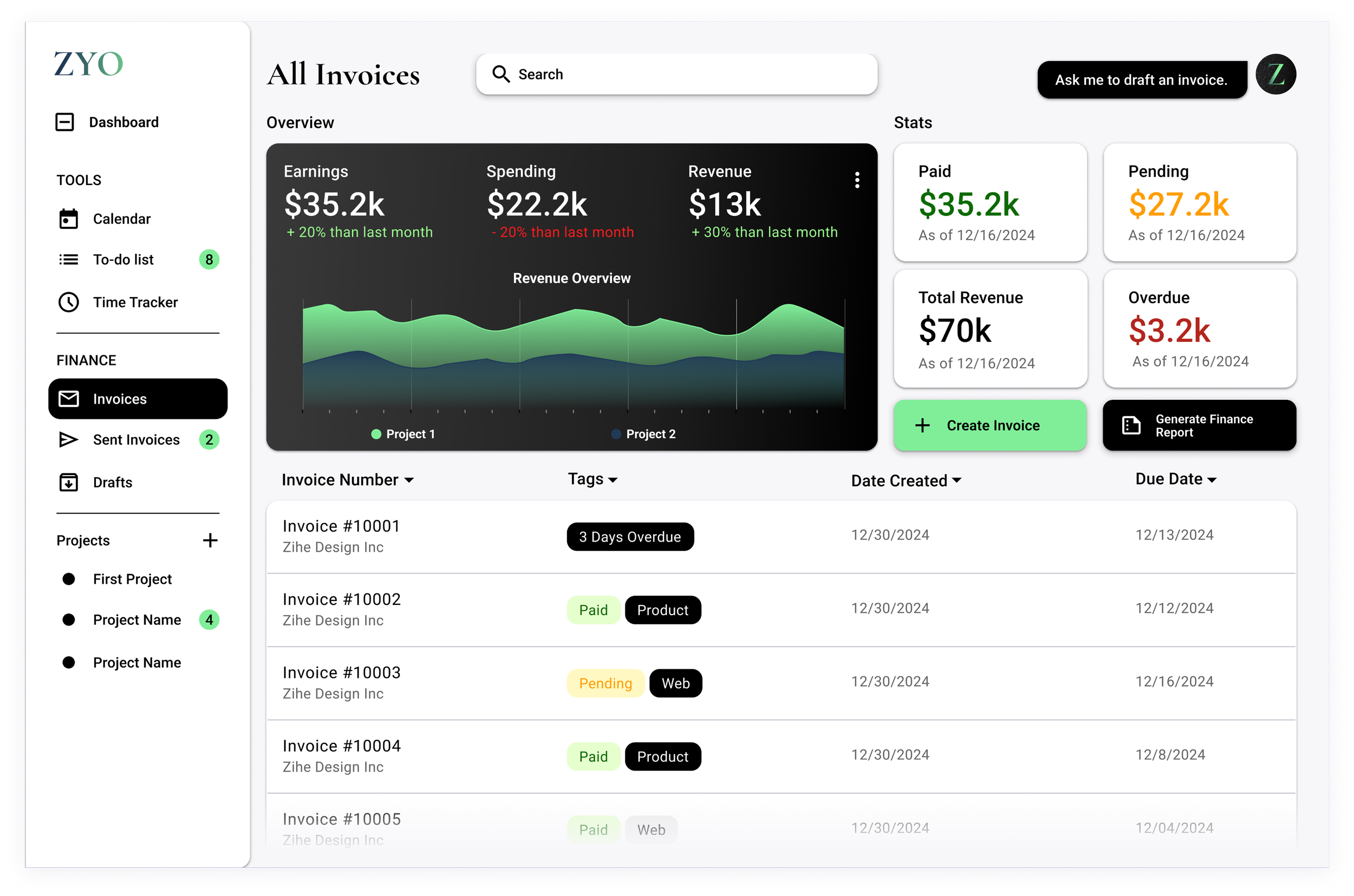
FEATURE 404 INVOICE
The Invoice page provides a quick finance overview of all recent projects. From here, users can create and send invoices, generate finance reports, and stay updated on the status of all sent invoices.
Z can help users automatically draft up invoices, or emails to remind customers of overdue invoices.


KEY TAKEAWAYS
Finding Inspiration: Sometimes, the solution to your problem already exists in another product from a completely different industry. As a designer, you should research wider range of products — don’t only fixate on competitors in your product’s industry!
Iterative Process: Early testing and revisions significantly improved the final product.
Simplicity is Key: Freelancers want tools that fit into their workflows, not tools they need to learn from scratch.
AI Implementation: AI is not to be scared of, it’s a convenient tool that helps streamline the design process and user flow.
NEXT STEPS
Conduct more usability testing with a larger group of freelancers.
Build a mobile version to make ZYO accessible on the go.
Explore AI features that address other pain points like enhanced collaboration tools.
Wanna see the whole process?
Or use the bottom nav to see my next project.