
ZYO
Designing a project management app that seamlessly fits into existing workflows.
Role: UX Research, UI Design, Visual Design
Timeline: 4 days sprint
Platform: Web Application
Read Time: 10 mins
Overview
ZYO is a platform designed to help freelancers simplify project management, time tracking, and invoicing. The name "ZYO" comes from the Mandarin word "自由" (zìyóu), meaning "freedom." The goal is to give freelancers that sense of freedom by taking the hassle out of administrative tasks, so they can focus on what they love doing.
The ProblemThe Current Apps on the market has unintuitive workflow, lacks collaboration features, and has a steep learning curve.
After a full day of user research, these are common themes creating gaps on the market that ZYO can target and stand out from the competition. Due to the time constraint, I chose to prioritize solving unintuitive workflows. While developing all other basic features.
-
Forgetting to start or stop timers is a common pain point, having to correct time logs later is a frustrating and time-consuming process.
-
It’s hard to share updates with collaborators without exposing sensitive information or spending too much time on manual reporting.
-
Many existing solutions are packed with unnecessary features, making them confusing and intimidating for beginners.
Feature 1AUTOMATED TIME TRACKER
The Time Tracker page offers the Timer tool and an overview of the user’s billable hours. The timer tool is automated with smart suggestions to fill in gaps or adjust logs.
After the timer is activated, a floating window hovers on the desktop to remind users to log their session. Using a tags system removes need to assign each time record to specific projects, offering freedom and flexibility for different users.


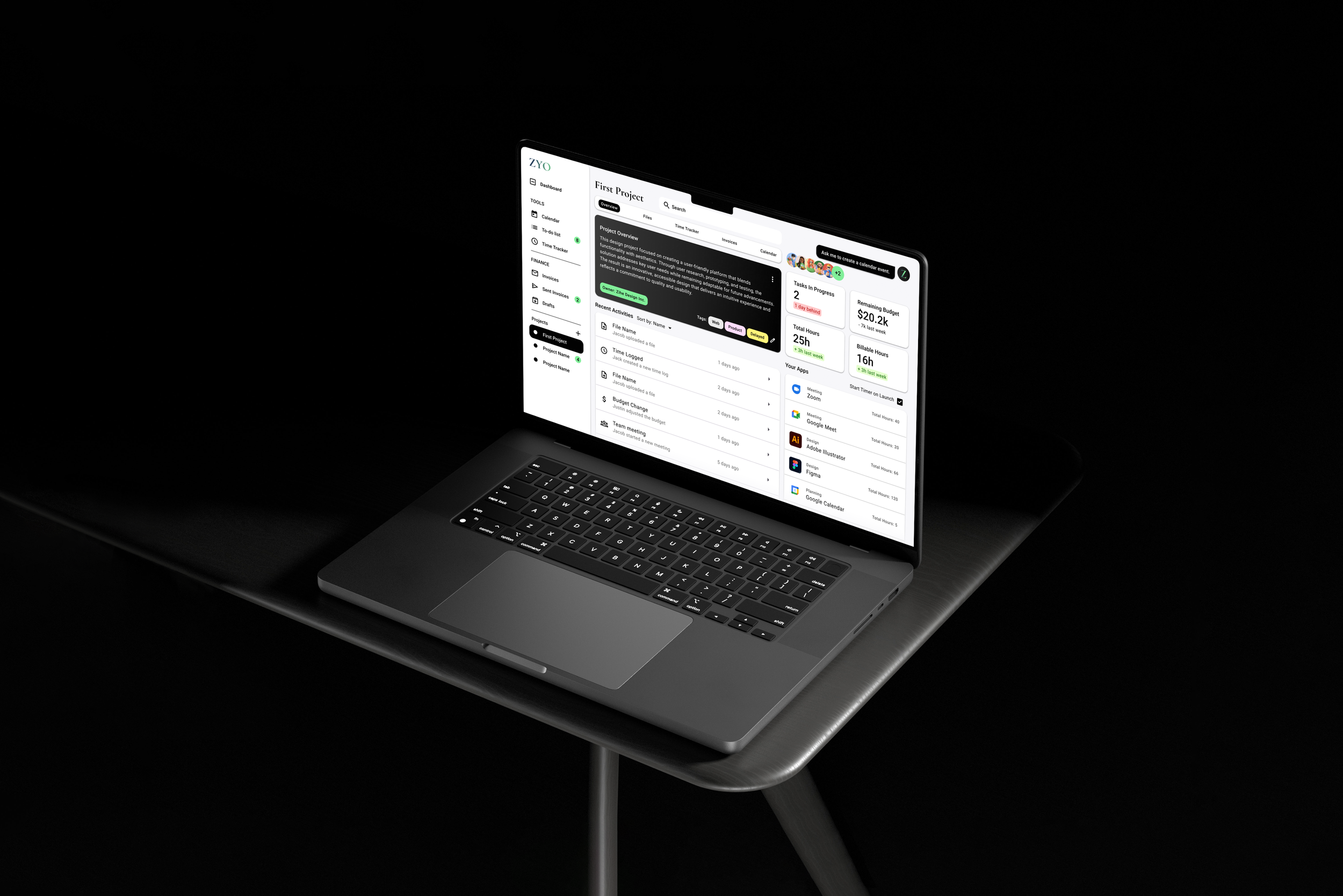
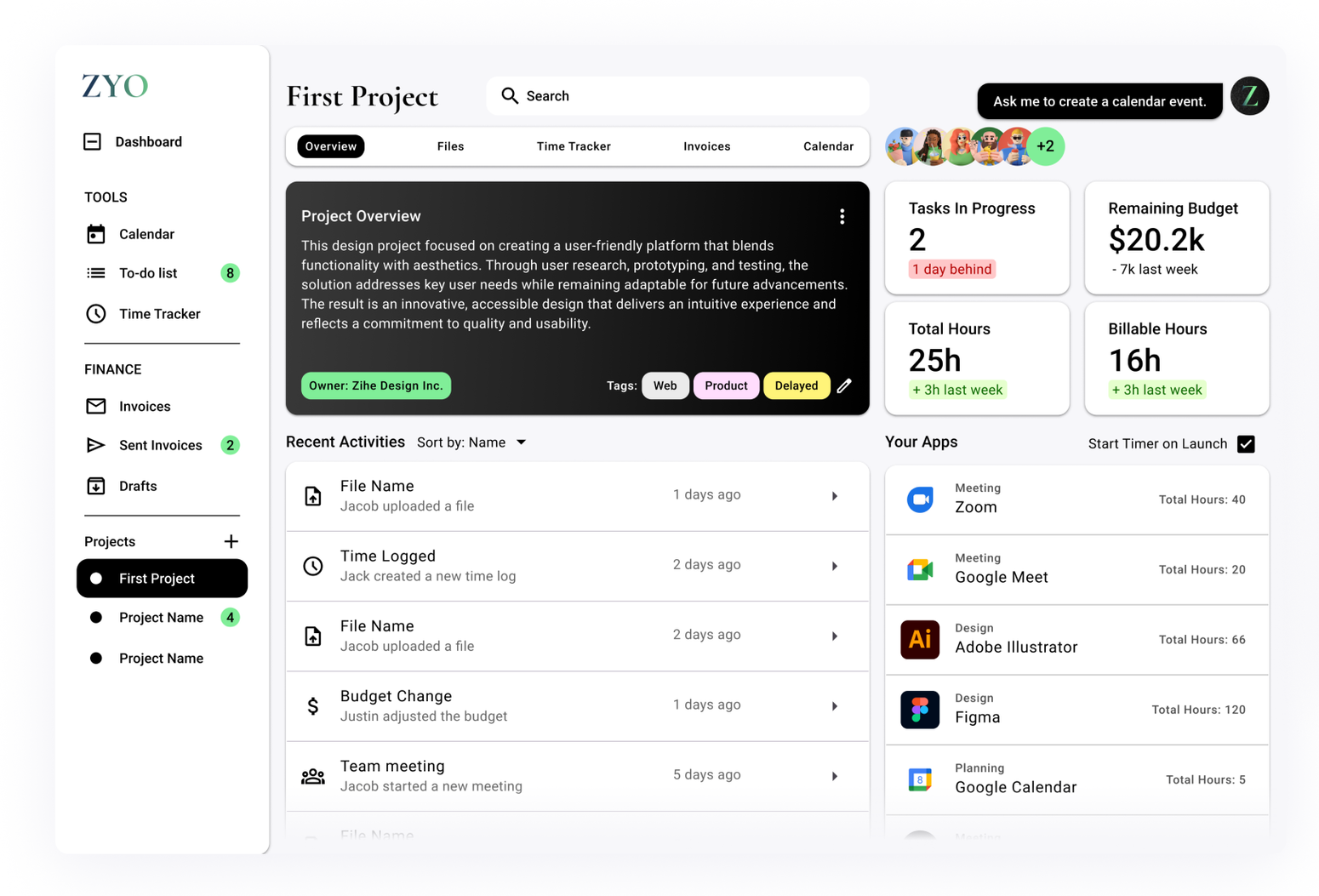
Feature 2PROJECT OVERVIEW
The project overview includes an App Launchpad aimed to support the automated time tracker function. When the user launches a tool from this page, the timer automatically starts logging billable hours.
The Project Overview page updates you on recent activities and changes made by your team. This ensures effective communication between members by keeping everyone up to date.
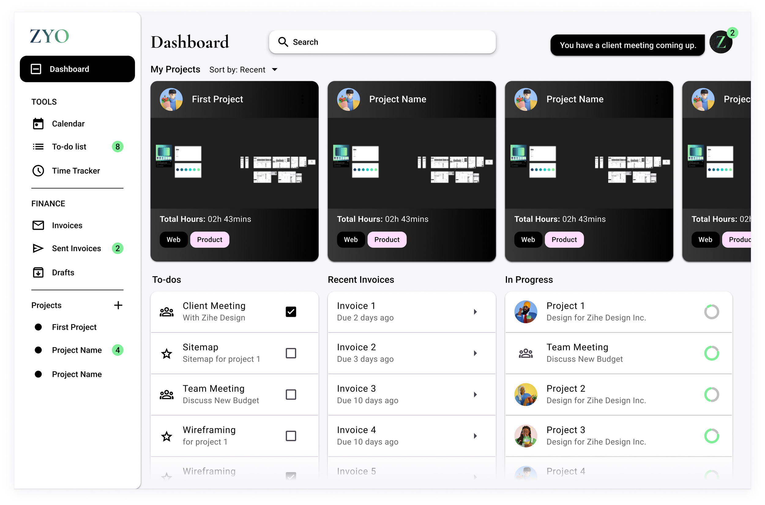
Feature 3DASHBOARD
The Dashboard gives a quick overview of all current active projects. From here the user can choose to navigate to recent projects, pick up tasks in progress, or act on overdue invoices.
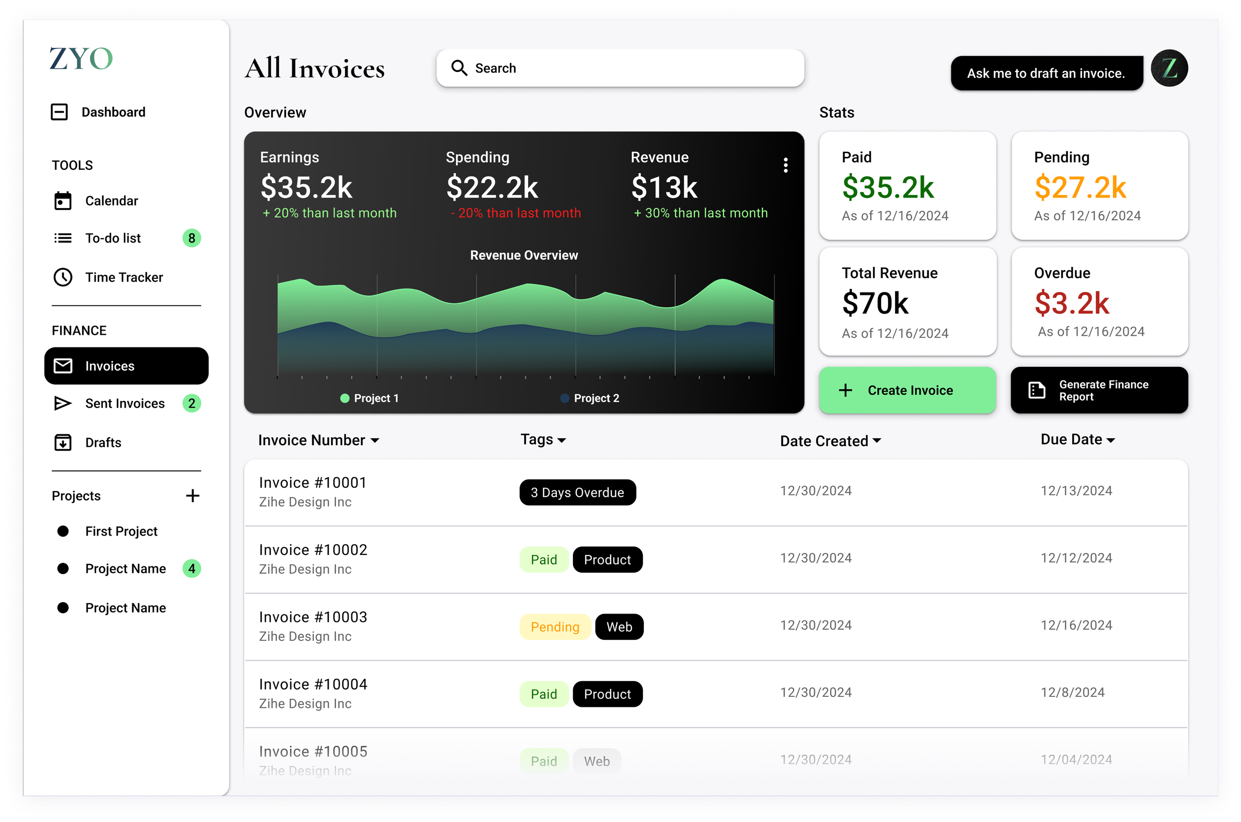
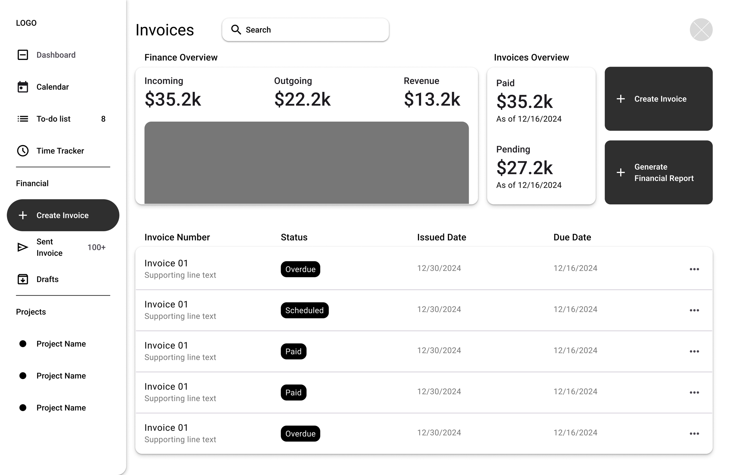
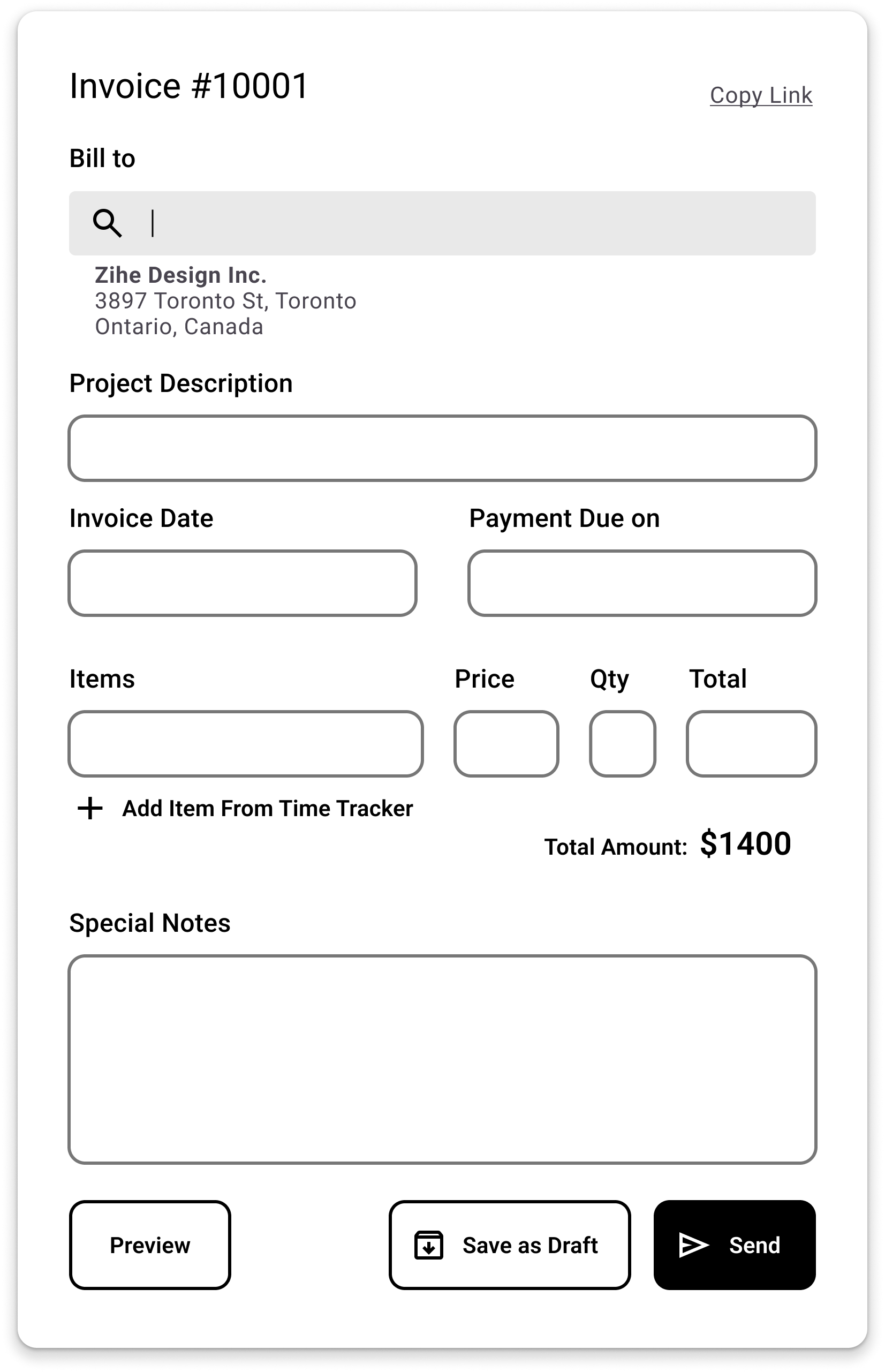
Feature 4INVOICE
The Invoice page provides a quick finance overview of all recent projects. From here, users can create and send invoices, generate finance reports, and stay updated on the status of all sent invoices.
Z can help users automatically draft up invoices, or emails to remind customers of overdue invoices.


Day 1
Understanding the Users
Competitor products offer complex tools that are hard to incorporate into current workflows.
Weaknesses:
Bonsai: High subscription cost; steep learning curve for new users.
Toggl Track: Limited invoicing functionality.
FreshBooks: Overly focused on accounting; less intuitive for project management.
Clockify: Lacks advanced features for invoicing and financial reporting.
HoneyBook: Overly niche, targeting creative industries.
AI Brainstormed User Personas & Solutions
Gaps:
Pricing: Lack of tools from free tier subscription.
Collaboration restraints: Lacks collaboration and team management features.
Onboarding: Tools either lacked advanced features or were too complicated for new users.


It all comes down to this:
How might we prevent the user from forgetting to track their billable hours?

Being inspired by Steam, the gaming platform
Midway through my design process, I realized I was approaching the problem like any typical project management app—building a time tracker that relied on the user to manually start and stop it. But that manual aspect was exactly what I wanted to eliminate.
The breakthrough came unexpectedly during a gaming session with friends. I noticed that Steam automatically tracks how many hours a player has spent in a game. It starts timing when the game launches and stops when it’s closed.
That insight sparked an idea: What if ZYO could do the same for creative work? Instead of asking users to start a timer, ZYO could detect when work begins—like opening design software or switching into "focus mode"—and track hours automatically. This small shift could solve a major pain point: forgetting to track billable time.
Day 2
Starting the design
Mapping out user journeys, site maps, and user flows.


Sketching paper wireframes while keeping different screen sizes in mind.


Building a UI that feels familiar to the users.
After coming up with initial concepts on paper, I translated those sketches into digital designs using Figma. Here are the main screens I focused on:
Dashboard: It’s a central hub for tasks, projects, and invoices.
Invoice Editor: A simple tool that makes it easy to create, edit, and send invoices with confidence.
Time Tracker: An automated tool that gets smoothly incorporated into the user’s workflow.


Make the time tracker smart by automating the start timing and log hours features.
After the breakthrough I wireframed an automated timer with smart suggestions to fill in gaps or adjust logs. Using a tags system removes need to assign each time record to specific projects, offering freedom and flexibility for different users. More importantly, I developed a launchpad that allows the app to automatically start the timer on launch.


Day 3
User Testing
User testing with 5 freelancers in different industries and digital literacy.
5 participants with different occupations and tech literacy were invited and given up to 3 tasks to complete. Both quantitative and qualitative data were collected. They were encouraged to speak out what they’re thinking while performing these tasks.
KPIs: Time on task, User error rates, Navigation vs. Search
Study Type
Moderated usability study
Participants
5
Location
Remote via Zoom
Length
20-30 mins
Here are my insights:
Navigation
Navigation bar was confusing, which increased time on task. Users spent a lot of time reading through the options.
Solutions
Group related navigation items to improve scannability
Visually reduce spacing to create clearer sections
Use more intuitive labels and icons to guide users quickly
Invoice Creation
Large CTAs were mistaken for windows. Users noted the lack of sorting function and missing tax info on the editing screen. They also wanted more information visible in the invoice list.
Solutions
Redesign CTA buttons to differentiate them from window elements
Add a sorting feature for better invoice organization
Include editable tax fields directly on the invoice editing screen
Display additional invoice details (e.g. client name, due date, total) in the list view for quicker overview
Automated Timer
Users appreciated the concept of the automated timer but often lacked confidence in whether it had started or was accurately tracking their time. Some users reopened the app to check, while others manually recorded time out of habit or mistrust. A few participants mentioned that they wanted more control and visibility, especially when switching tasks or tools.
Solutions
Add a persistent, lightweight visual indicator (e.g., mini timer or status dot) to confirm that tracking is active
Provide a clear notification or toast message when the timer starts and stops
Offer a manual override or pause/resume control for users who want more flexibility
Day 4
Final Prototyping
Hi-fi prototypes with iterations from user testing insights and accessibility considerations.
My next step is to implement solutions to insights found during usability studies, and add branding to the product. These are the key changes:
Grouped navigation items more intuitively and improved spacing.
Added sorting and tax fields to the invoice editor.
Redesigned project cards to display information more clearly.


Adhering to WCAG AA standards and applying 4-point spacing rule.
Ensuring accessibility was a key focus:
I chose colors that met WCAG AA standards for contrast.
Used two typefaces (Garamond for headlines and Roboto for body text) to maintain consistency and readability.
Applied a 4-point spacing rule to create a clear visual hierarchy.


KEY TAKEAWAYS
Finding Inspiration: Sometimes, the solution to your problem already exists in another product from a completely different industry. As a designer, you should research wider range of products — don’t only fixate on competitors in your product’s industry!
Iterative Process: Early testing and revisions significantly improved the final product.
Simplicity is Key: Freelancers want tools that fit into their workflows, not tools they need to learn from scratch.
AI Implementation: AI is not to be scared of, it’s a convenient tool that helps streamline the design process and user flow.
NEXT STEPS
Conduct more usability testing with a larger group of freelancers.
Build a mobile version to make ZYO accessible on the go.
Explore AI features that address other pain points like enhanced collaboration tools.